





Ellyt Brand Guidelines
About the brand
You have opened the Ellyt brand manual. The Ellyt logo is just a small part of our essence. The brand essence consists of visual elements, communication and jointly agreed rules that bring the Ellyt brand to life and make it grow.
On this page you will find instructions on how to use the Ellyt identity so that it is consistent, uniform, and highlights our values, which is why we do all this.
If you have questions, don't improvise, ask for help: contact@ellyt.eu
Mission
Our mission is to change people's nutrition healthier. Don't eat crap!
Average price level = high-quality and nutritious snack.
Vision
Our vision is to diversify Estonian (and Northern countries) snack culture in Estonia (Northern countries) by providing healthy, tasty and nutritious snacks.
Healthy with food!


Tone of voice and target groups
The image and character of a brand plays an important role in how we want to appear in people's minds. Our actions are evaluated through the image we create.
When creating a strong image, its consistency and integrity in everything we do is vital – in marketing efforts, communication with clients, business partners, in journalism, within the Ellyt team.
We want customers to see us:
- as a friendly professional who is
- dedicated and
- trustworthy in everything we do or say.
Ellyt marketing communications appeal to all target groups, but at the same time we remain true to the essence and identity of the brand.
Ellyt main target groups:
- School students: elementary school, high school, university
- Working people: shift workers (e.g. drivers) and office workers
- Employers (snack machines, wholesale)
- Young family (new mothers)
- Amateur athletes
How we speak
We are kind and warm:
“You are always welcome”
We know what we're talking about.
“We can help you”
We let people make a decision themselves
“"Please, come and try, you might like it"”
How we don't speak
We are not official:
“"We expect to meet you in our office"”
We are not arrogant:
“"We know better what you need"”
We don't agitate:
“"Buy it - you'll love it"”
The main elements of the brand
Logo
Ellyt logo is our identity that stands out!
What we do under the Ellyt logo on a daily basis represents our brand!

Slogan
Smart snacks for busy people!
Use of the logo
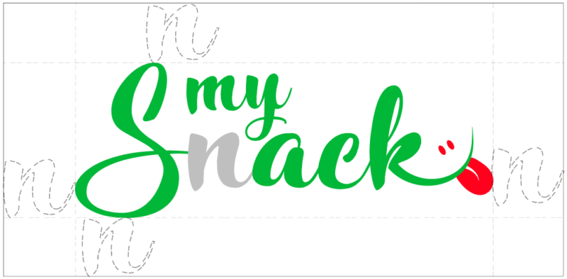
The Ellyt logo has its safe zone, which we kindly ask to respect.
Don't over use logo or its elements and slogan on the same design. Remember - less is more.
DON’T:
stretch the logo

DON’T:
change main colors other than shown in CVI

DON’T:
tear, cut or move around different parts of the logo
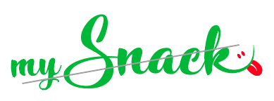
DON’T:
mix main logo with other colors that are not shown in CVI

Colors
Elly's main color is GREEN SPRING.

GREEN SPRING
#00B737
RGB 0:183:55
CMYK 100:0:70:28

JUNIPER
#2F5C00
RGB 47:92:0
CMYK 100:0:70:28
On our marketing materials we also use secondary colors to express the brands nature.

WILD LIME
#B3DE6C
RGB 179:222:108
CMYK 19:0:51:13

OPAL BLUE
#ADDBC4
RGB 173:219:196
CMYK 21:0:11:14

SUN GLOW
#FFCA00
RGB 255:202:0
CMYK 0:21:100:0

APRICOT CREAM
#EDCFA7
RGB 237:207:167
CMYK 0:13:30:7
Typography
Ellyt typography reflects simultaneously both playfulness and excitement as a pure and minimalistic style. Contrasted strong title, the content texts are soft and modern. Balance for the playful colors and detailed packaging the usage of fonts are rather minimalistic and confidence building.
Italic is only used to mark comments of foreign words. Bold is used to bring forward a very important or specific part of the text.
Arial is used in documents, e-mails and other official materials.
Titles (Knight Brush)

Primary bodytexts (Cocogoose Pro Light)

Quotes / scripts (Knight Brush)

Secondary bodytexts / subtexts (Cocogoose Pro Thin)

Design Principles
Pattern
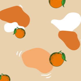
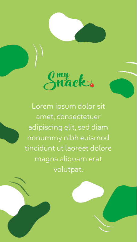
Due to the wide assortment and very detailed design of the brand's own products, the visuals should be more simple and minimalistic. Details used on product packages can be brought out on other designs:
- random color spots
- “brushed” lines
- fruit illustrations
Follow the main design principles and colors when using patterns and elements.
Use smooth and round elements and avoid sharp corners if possible.

Icons







Social Media
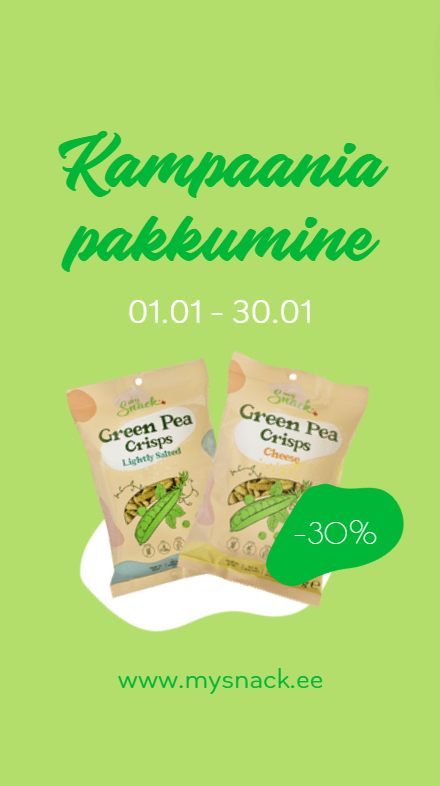
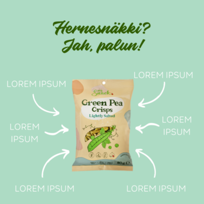
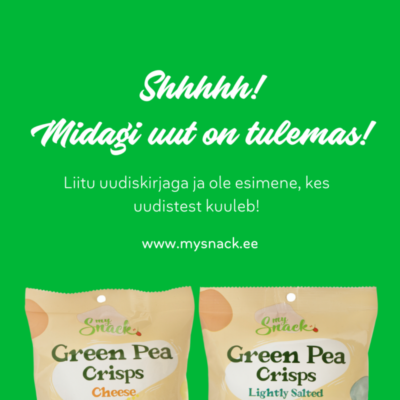
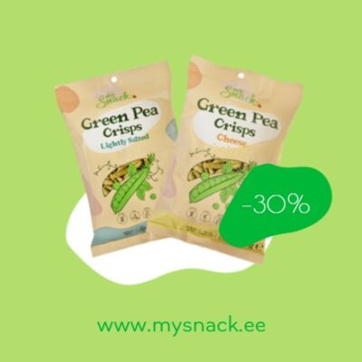
Brand social media visuals and marketing activity should carry the same values as the brand in general – to be cheerful, colorful, respectful and close to nature, emphasis on the message, not on too many details.
Graphic design alternating with pictures gives an opportunity to highlight the brand values and message. Content must be authentic and emotion-oriented. Avoid direct sales and heavily promoted shopping messages. Organic content should be more oppressive to feelings, include tricks and recommendations, recipe ideas and reminders, be educational. Direct sales messages on social media should rather be placed to advertising content and/or email marketing.